Aspora is a rapidly growing fintech company with 1M+ users that enables its users to manage, send, and spend money across borders. Over the past couple of months, I helped them craft a personality for some of their existing core products and leverage that to shape new ones.
The company did a speed run when it went from a product built around sending money to letting users spend and manage it as they move across borders. Somewhere in that, the experience missed out on some much-deserved love: a cohesive language and a core personality that makes it memorable.
With that as our north star, we set out to build an identity that Aspora could call its own.
Crafting distinct identities
Since the product line and capabilities were still expanding, we honed our focus on unifying the core identity elements that could carry across all the apps. We added visual elements, streamlined the information on each screen to reduce cognitive load, and tied it together with interactions that could scale. Let me explain with some examples.
Certain journeys, like onboarding or sending money, are anchored around a promise that motivated the user to start them in the first place. A reward or zero transaction fees for getting onboarded, or the best possible exchange rate while sending money. We arranged the information on each screen so it always kept that promise front and center.
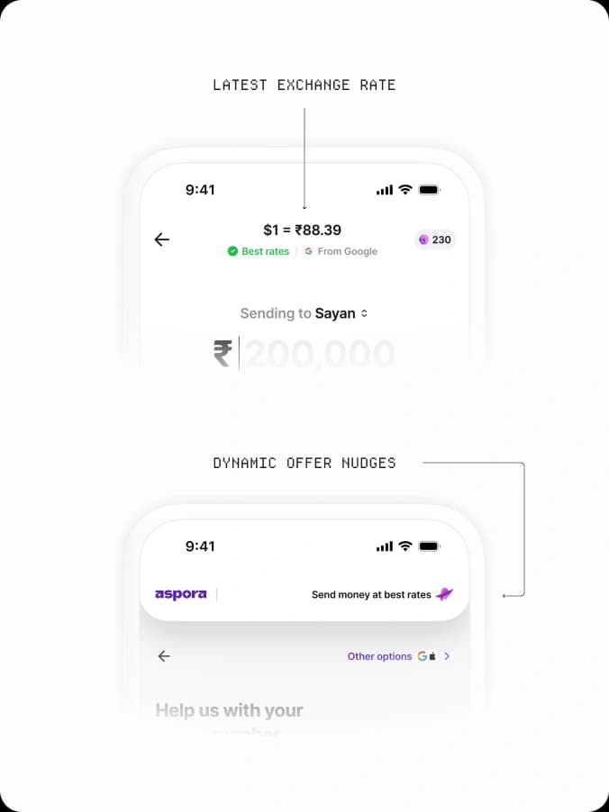
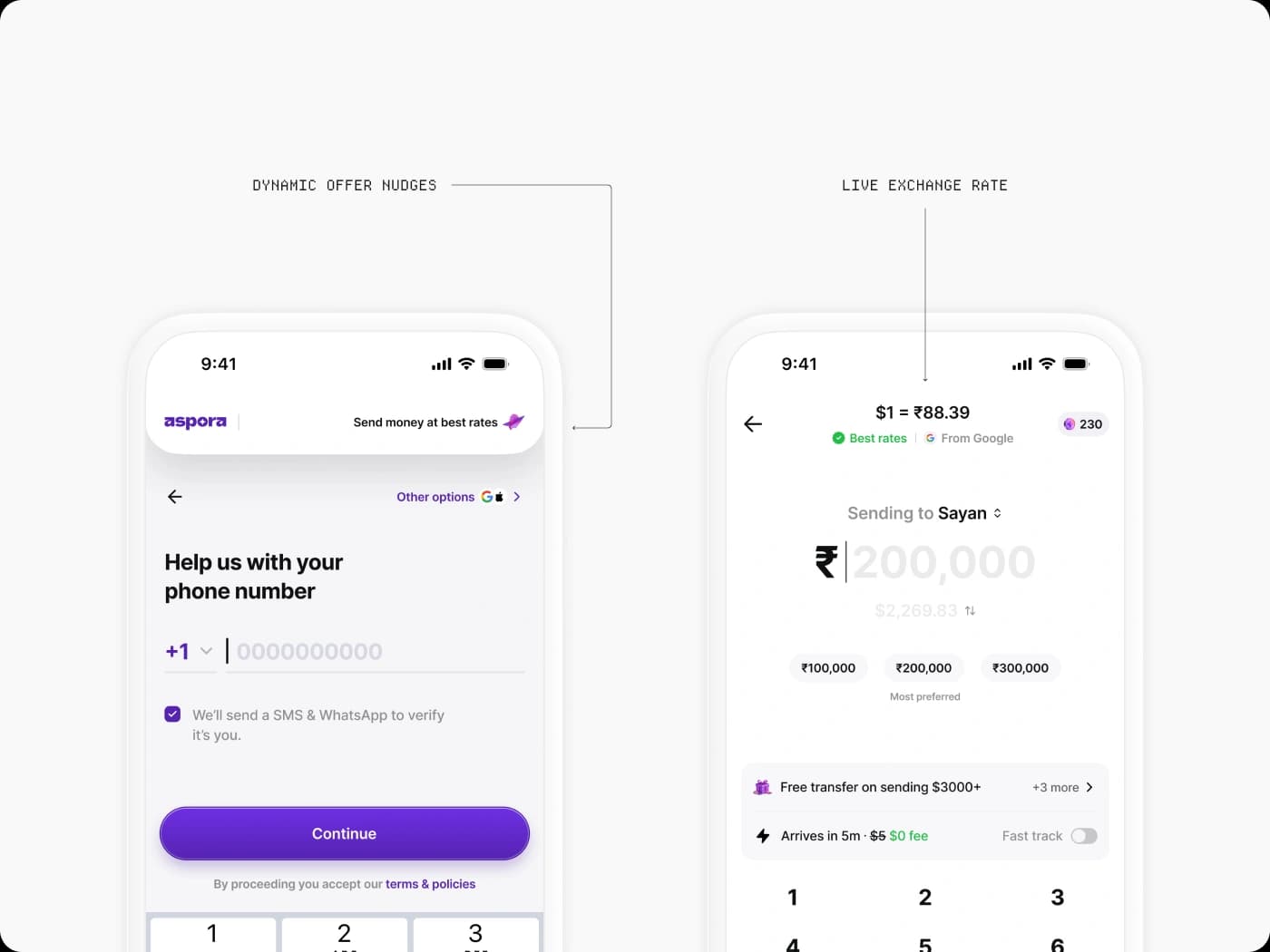
Core promise for onboarding and send money screens
Other journeys work differently. For ones users hit more frequently, like checking conversion rates, or ones anchored around a single action, like referring a friend, we designed a visual entity to build the product around. For rates, it was the rate number itself, shown in an interactive way. For referrals, it was a sweet-looking referral card that added a touch of delight when someone shared the app.
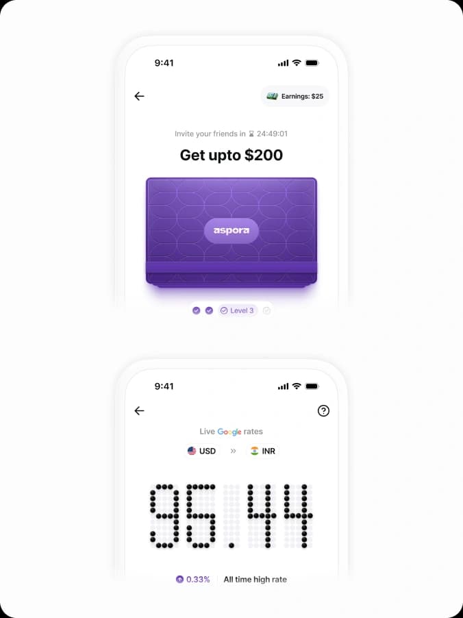
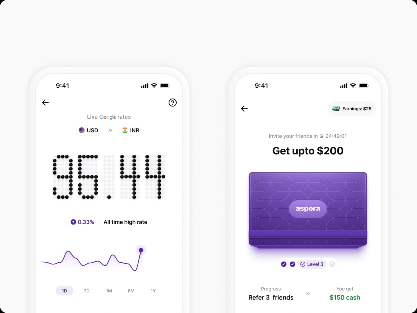
Visual anchors for exchange rate and referral screens
Unifying through interactions
Putting all these details together so it clicks while still feeling delightful was a big part of what we wanted to focus on. Beyond the larger interaction patterns, we crafted quite a few small ones. Here are some of my favourites.
At the end of the onboarding journey, a globe morphs into the silhouette of the user's country, and once they select their home state, it morphs into an illustration that greets them on the home page.
While they're sending money over fast transfer, a gradient animation takes over the whole screen to indicate they've activated instant transfer.
Onboarding journey animation ; Instant transfer activation for sending money
The currency exchange rate animates to show whether it's gone up or down since the last time they checked.
And in the referral journey, when a user is about to send an invite, the referral card gets wrapped in a special envelope to send it off.
Exchange rate animation ; Referral card animation
Tightening the details
A big part of building the overall identity was distilling out the crucial data points we needed to show on each screen, and preparing it so that as the product line expands, it can host everything without dramatic changes.
The most evident example was the new home page: designing touch points that could host all future products while customising the page for each user depending on which features they used.
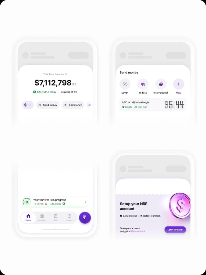
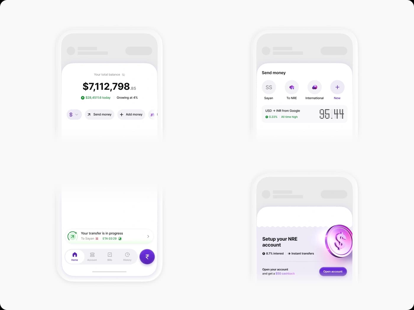
Home page modules which adapts to what each user uses
On the core screen users interact with before sending money, we accounted for every detail, big and little, so they had the full picture in view before going ahead with a transaction.
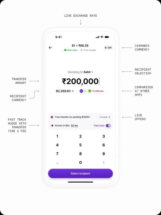
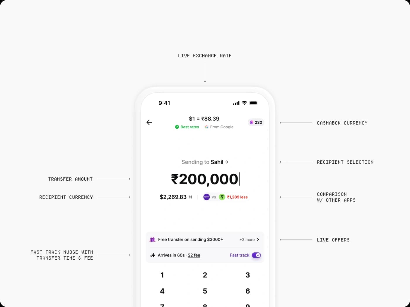
Breakdown of the send money screen
Sometimes we went a step further with quality-of-life features. Adding intelligence around exchange rates so users understand what might move a rate, or letting them get notified when they got a good rate, whether triggered by an event or timed to their paycheck.
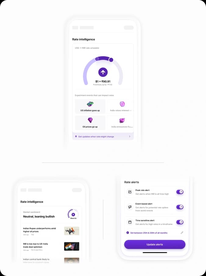
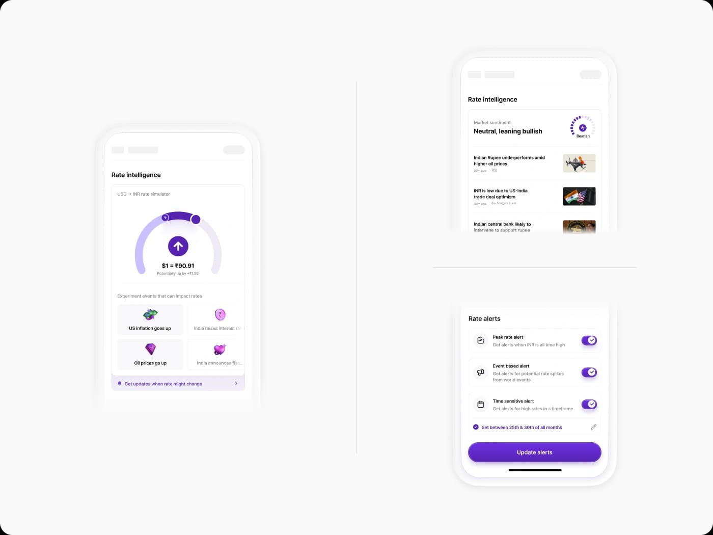
Rate intelligence screen modules
Thanks to Rajan Dube, Robin Mehra, Sahil Bhatia, and Shrivatsa Krishna for helping shape these experiences.